Redesigning Car Insurance Subscription Packages
Brief
The objective of this project is to enhance the user experience (UX) and user interface (UI) design for displaying three different car insurance subscription packages. The aim is to present the subscription options in a user-friendly manner, focusing on readability and clarity, and to guide users towards selecting a package that best suits their needs.
The target audience for this project includes individuals seeking car insurance coverage, particularly those who prefer the convenience of subscription-based models. This may encompass a diverse range of demographics, from young urban professionals to families and retirees
Project Goals
Improved User Experience: Create an intuitive and seamless user journey for exploring and selecting car insurance subscription packages.
Enhanced Information Presentation: Effectively communicate the features and benefits of each package through concise and engaging UI elements.
Encourage Decision Making: Facilitate users in making informed decisions by providing relevant information and clear comparison points.
Streamlined Subscription Process: Design a simplified subscription process, allowing users to easily sign up for their chosen package.
Research
Methodology Highlights
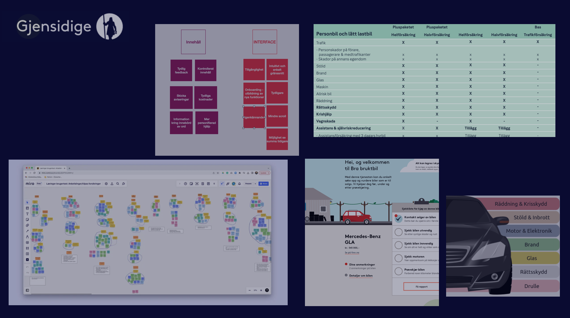
Commenced the project with comprehensive desk research, meticulously analyzing competitor package presentations to establish a robust foundation for subsequent investigation.
Facilitated internal interviews with key stakeholders at Gjensidige, each providing invaluable insights into package intricacies and pricing strategies.
Conducted extensive interviews with potential customers to gain deeper insights into their perceptions and the pivotal factors guiding their decision-making process
Implemented user testing sessions, during which users interacted with the Gjensidige website while purchasing car insurance, aiming to identify and rectify any potential usability issues.
findings
Lack of Clarity: Customers struggle to differentiate between insurance packages and understand their unique benefits.
Perception of Complexity: Complex terminology and pricing structures make Gjensidige's offerings appear overly complicated, deterring potential customers.
Price Perception: Some customers perceive Gjensidige as expensive without fully grasping the value proposition, indicating a need for clearer communication on pricing and benefits.
Color Scheme Overload: Excessive use of colors on the website overwhelms users, hindering clarity and focus on essential information.
Lack of Visual Hierarchy: The absence of clear visual hierarchy contributes to a cluttered UI, leading to confusion and difficulty in prioritizing information.
Complex Layout: The layout's complexity hampers user navigation and comprehension, necessitating simplification to improve engagement.
Transparency Regarding Costs: Users express confusion over terms and pricing implications, highlighting the importance of providing clear explanations and transparent pricing information for informed decision-making.
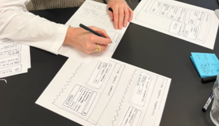
Ideation
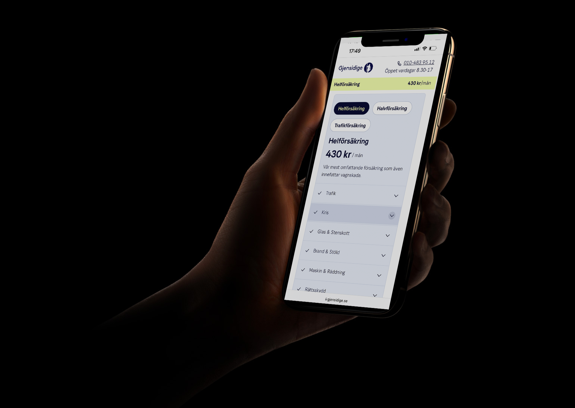
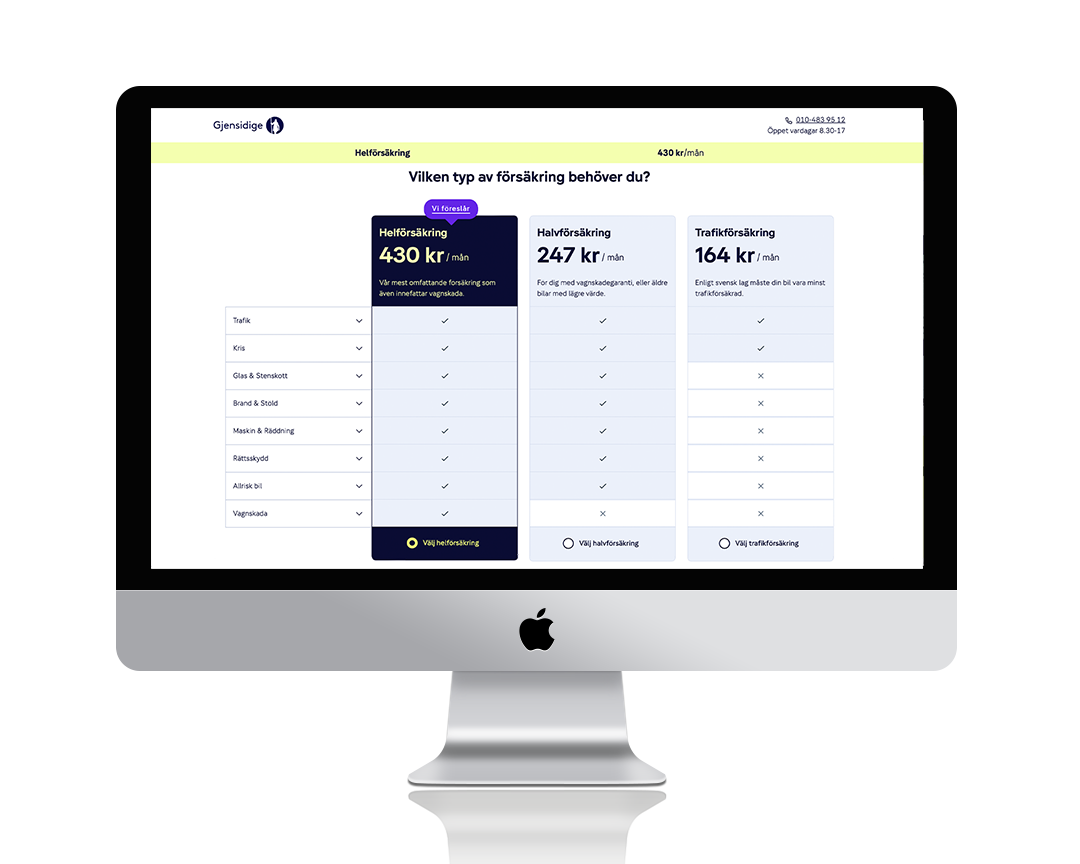
In ideation phase, prioritization includes: clear package comparisons, interactive elements for insights, personalized recommendations, transparent pricing displays, and mobile responsiveness. A streamlined interface is crafted to emphasize essential information, with clear content prioritization for intuitive navigation. Cohesion with the brand identity is ensured for trust, while inclusive features like high contrast and keyboard navigation are implemented for all users.
Design
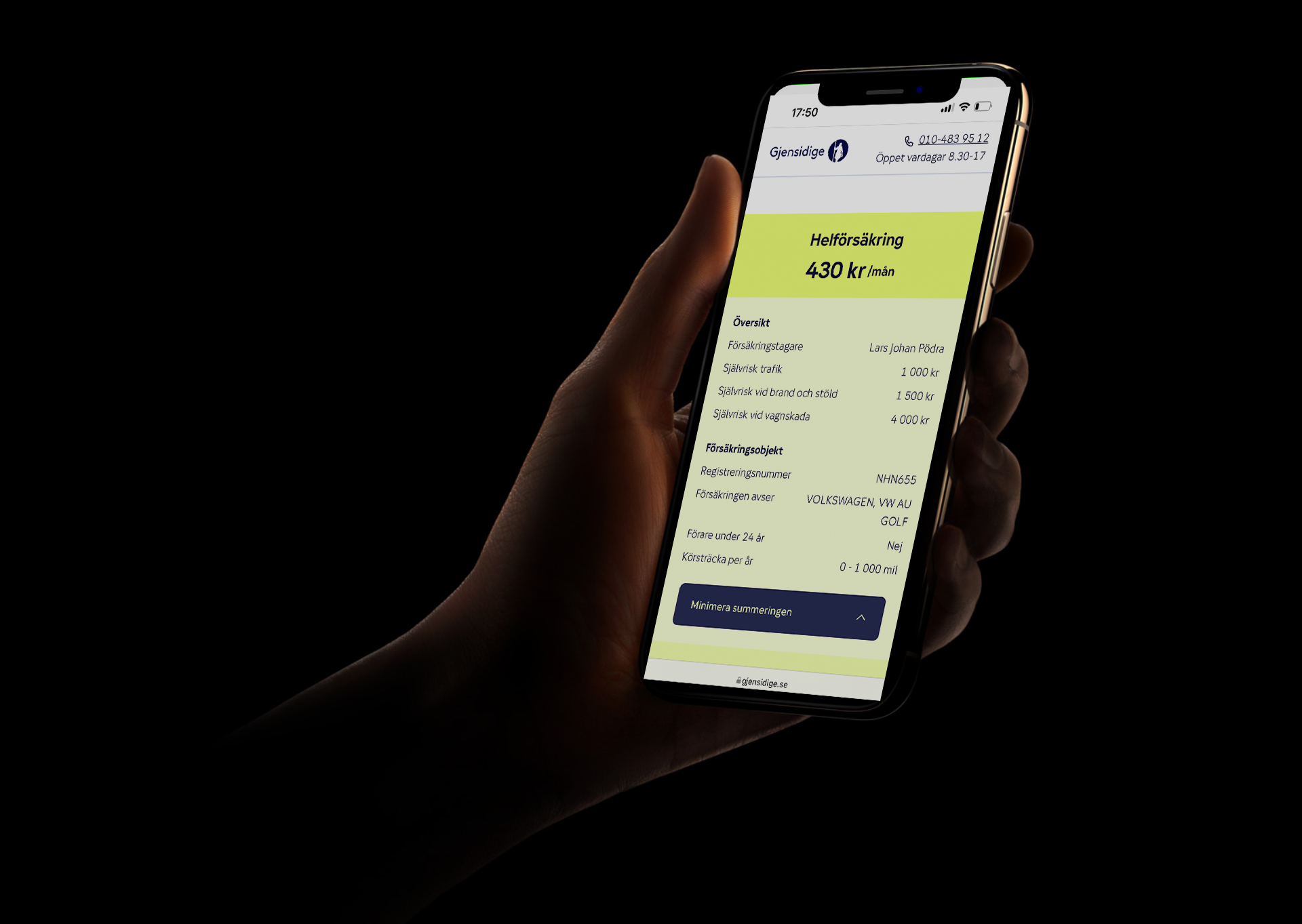
In the "Final Design" phase, the refined features and visual elements from the ideation phase are brought together to create a polished user experience across all platforms. This includes the strategic integration of tooltips and modals for enhanced user guidance, alongside a comprehensive summary feature for quick reference and ease of use.