UX Research and UX Design
Sleepy IS a Swedish online second-hand e-comm who wants to give the things we own a longer life and contribute to more sustainable consumption by making it more convenient for everyone. They help people sell used clothing and other items they no longer need across Europe.
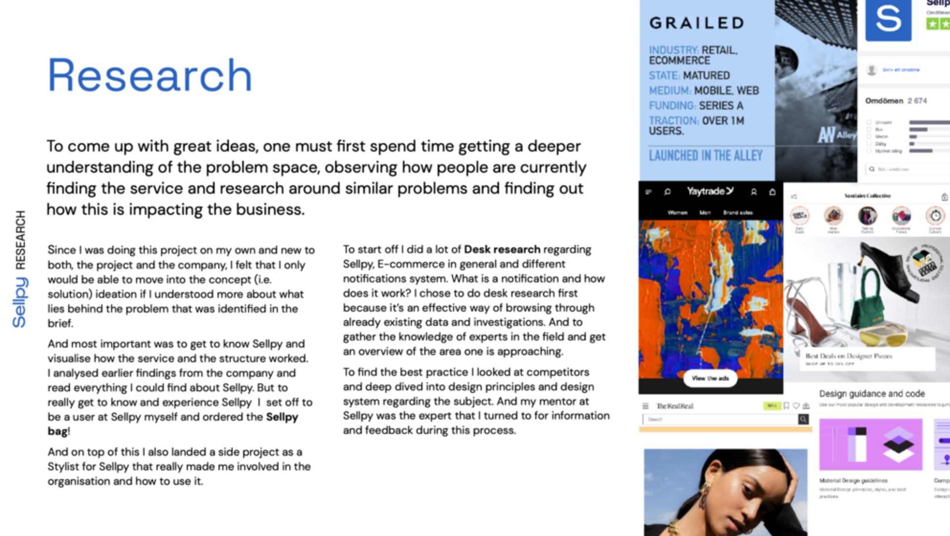
The brief
Sellpy are looking to improve the way they show important customer information and events to their users on site and thereby driving increased engagement and feeling of control. They are currently heavily reliant on emails, which certain information only existing in them.
Their hypothesis is that a notification center where they can collect all the information currently sent out in a large number of emails will make for an easier, clearer & better user journey which would guide the user to important events related to their selling and purchasing experiences.
MY Mission
In this role, the focus is on designing and executing experimentation activities to inform UX decisions and collaborating closely with cross-functional teams to refine notification system and my account page.
Through comprehensive analysis of user feedback and data, features are iteratively refined to meet both company objectives and user expectations.
This iterative process drives the exploration of new ideas, ultimately resulting in the creation of wireframes that guide final design and strategic implementation.
Assumtions
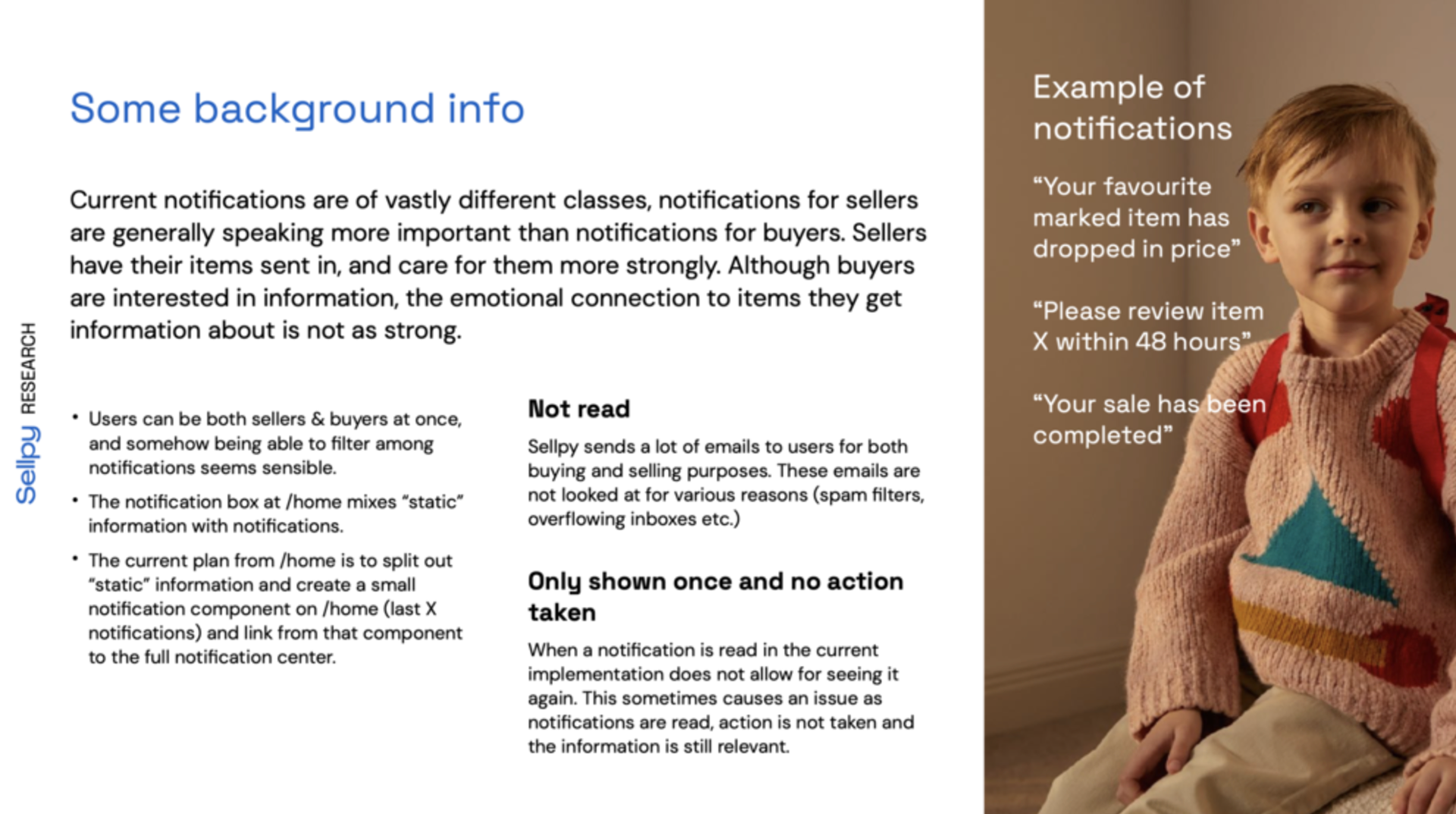
Sellpy users don't read their mail and they don't interact with the notifications.
Users can't see the difference between notifications and other information.
They are overwhelmed by too much information and mails from Sellpy.
Users need to be able to read the notifications more than once.
They don't know how to be more engaged in the Sellpy experience.
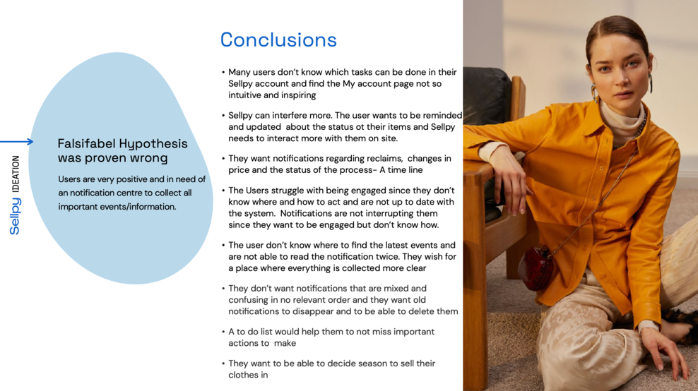
Hypothesis
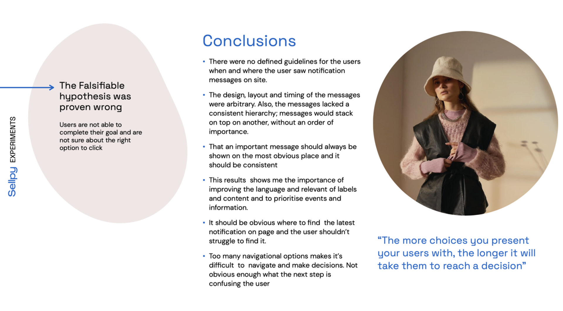
When formulating Hypothesis throughout this case I always make them falsifiable with the aim to prove them wrong. This method makes you more susceptible to capturing eventual biases in your initial assumptions. If you are able to falsify your hypotheses, then your initial assumption may have been correct.

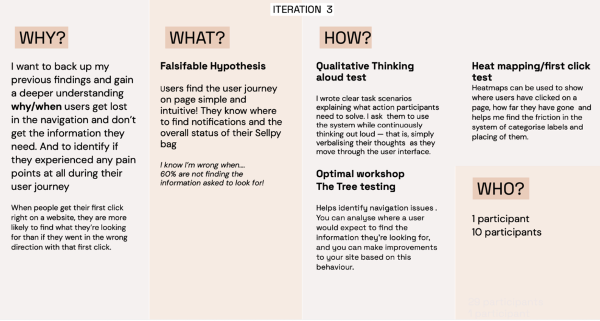
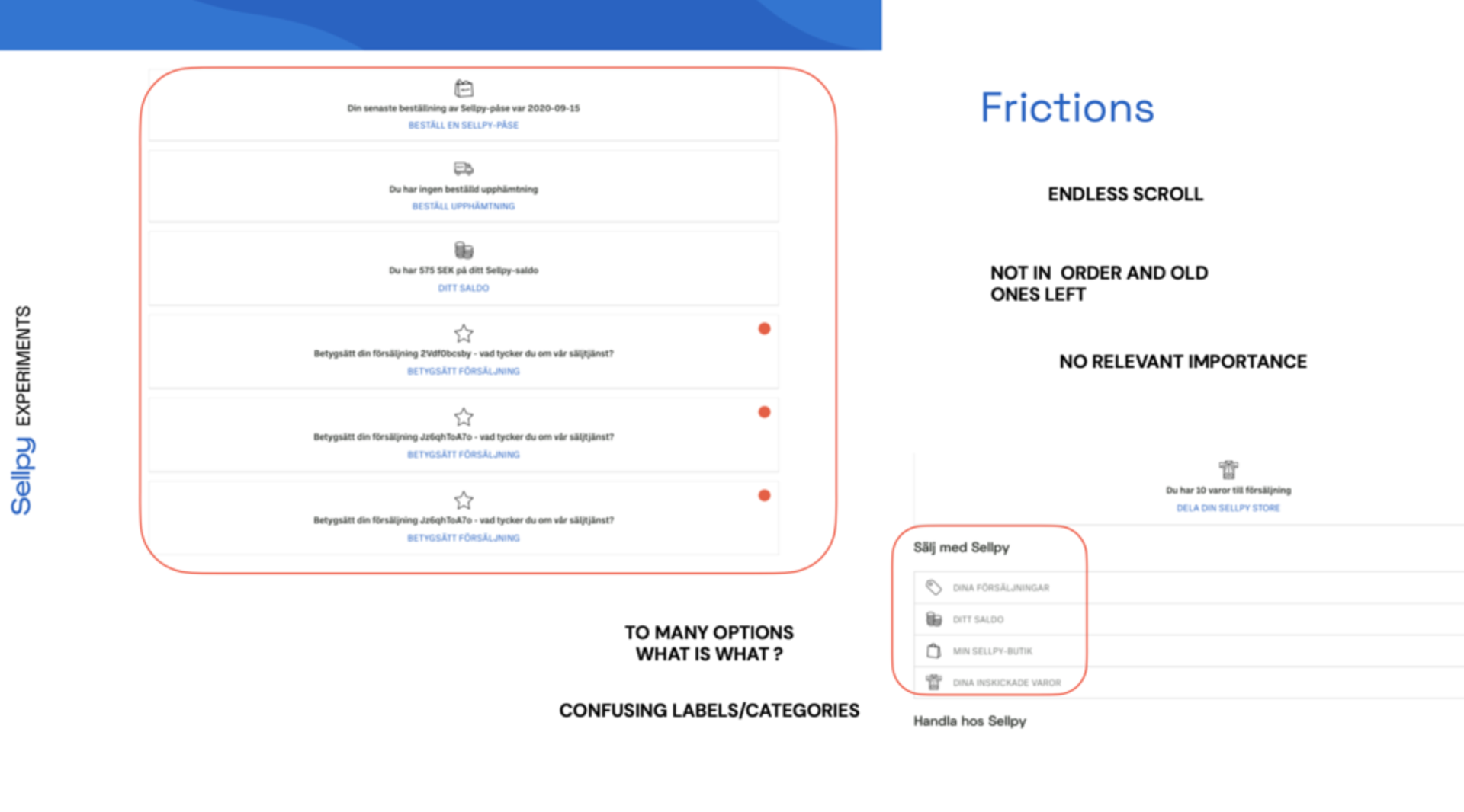
Experiments
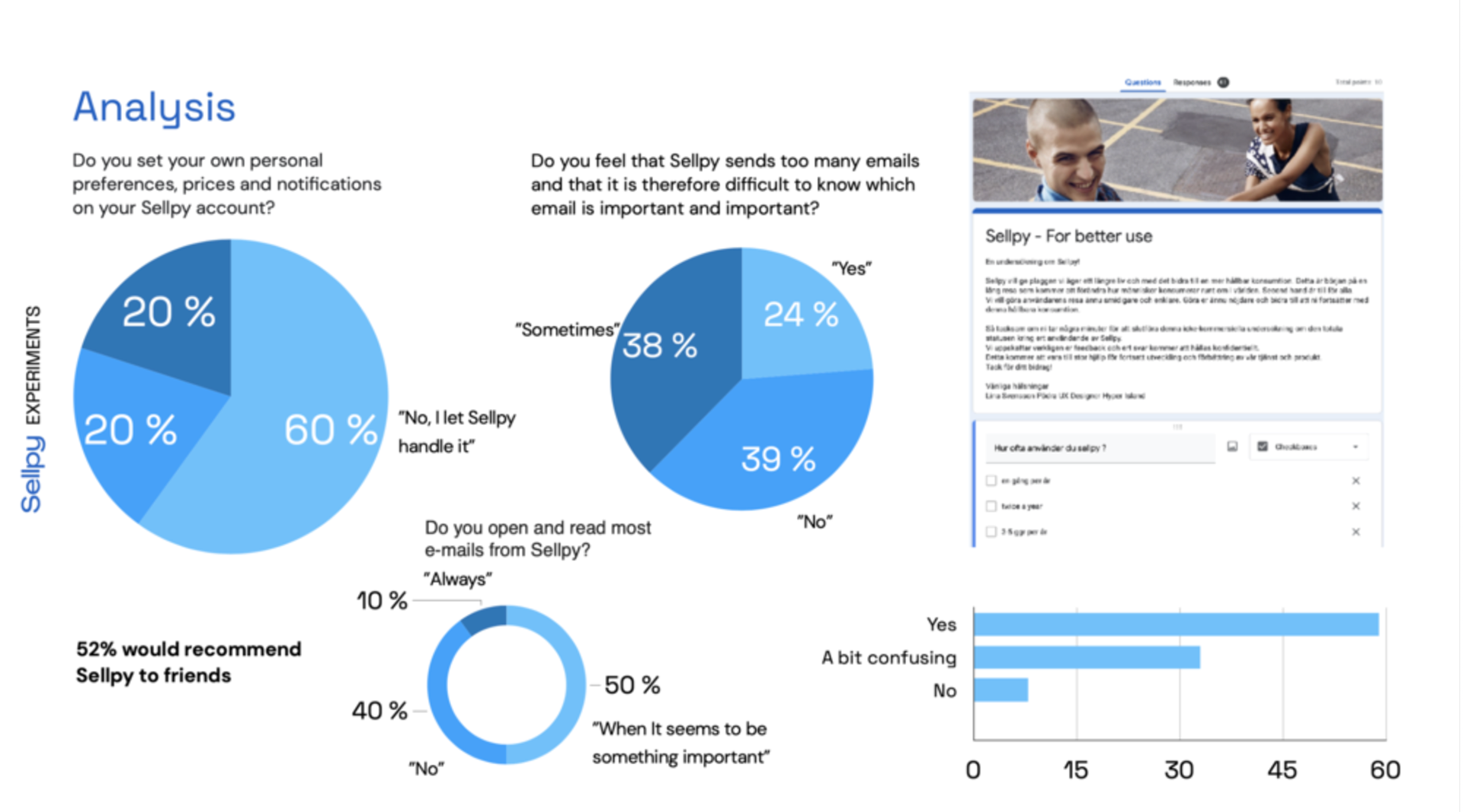
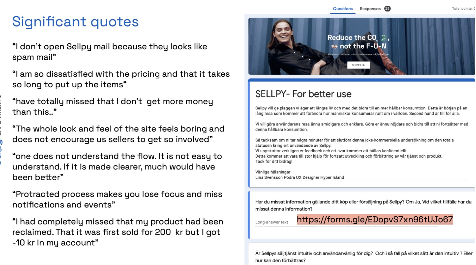
Analysis & Insights

Quantative survey


Ideate
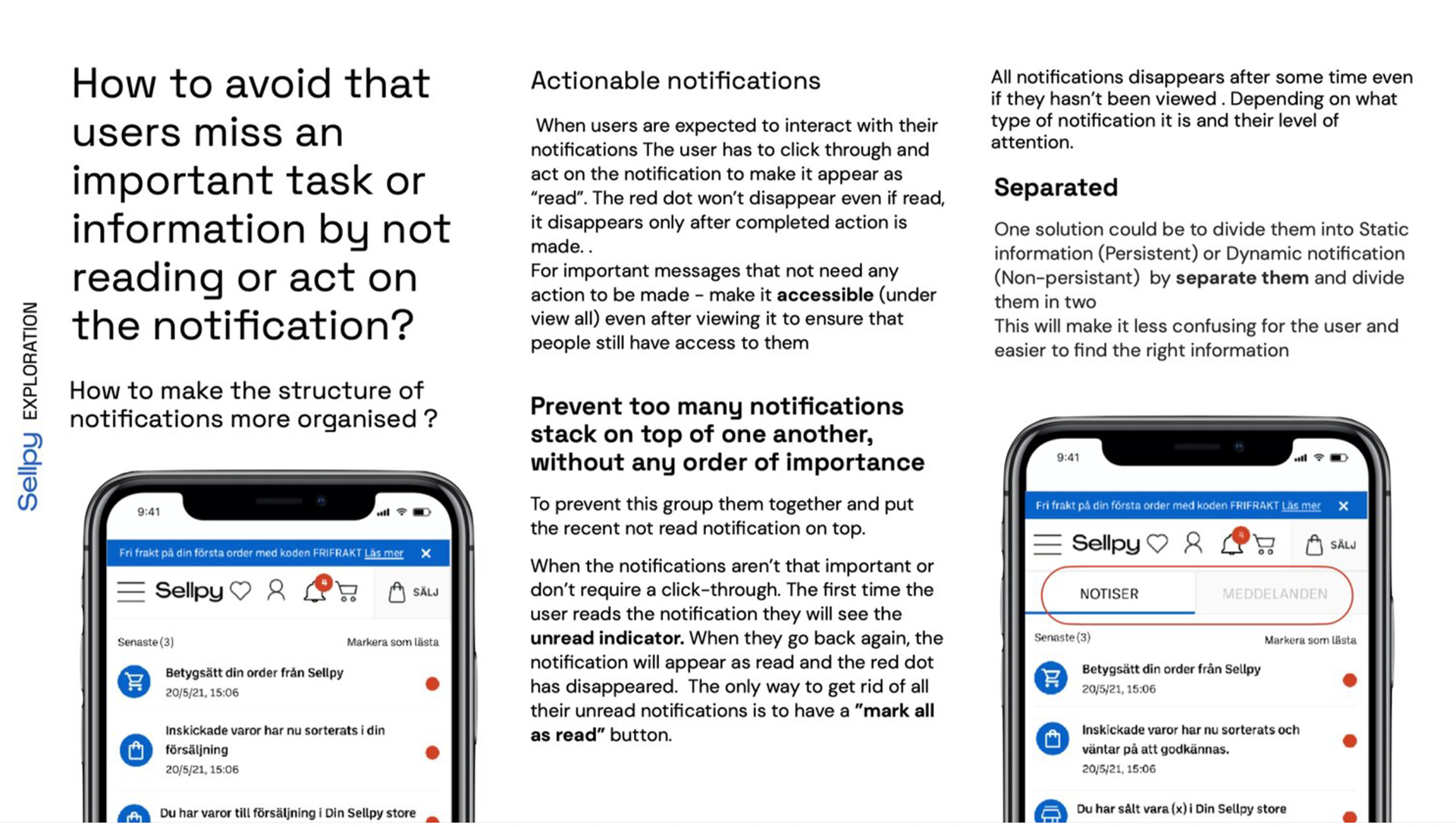
How can we gauge the potential usefulness of a notification center for users and how can I optimize its design to enrich their experience on Sellpy?


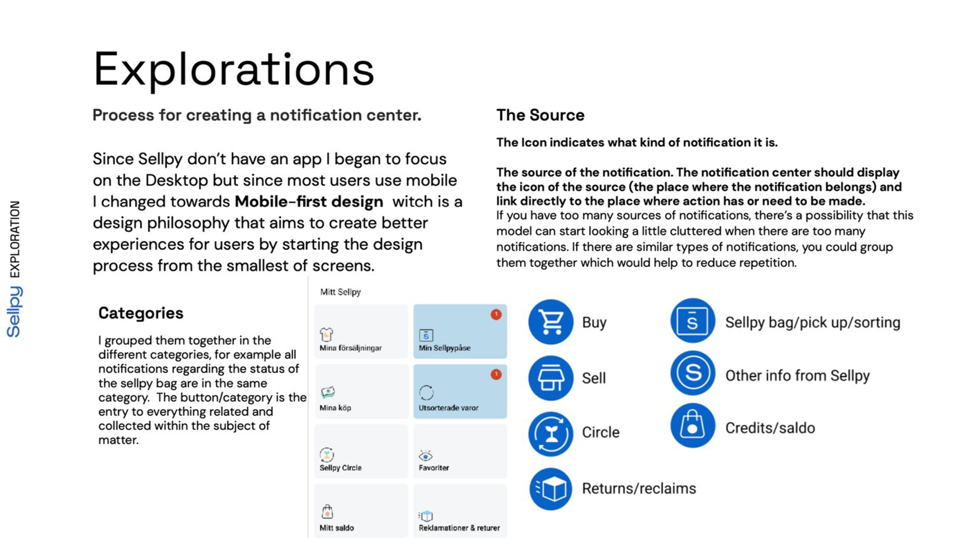
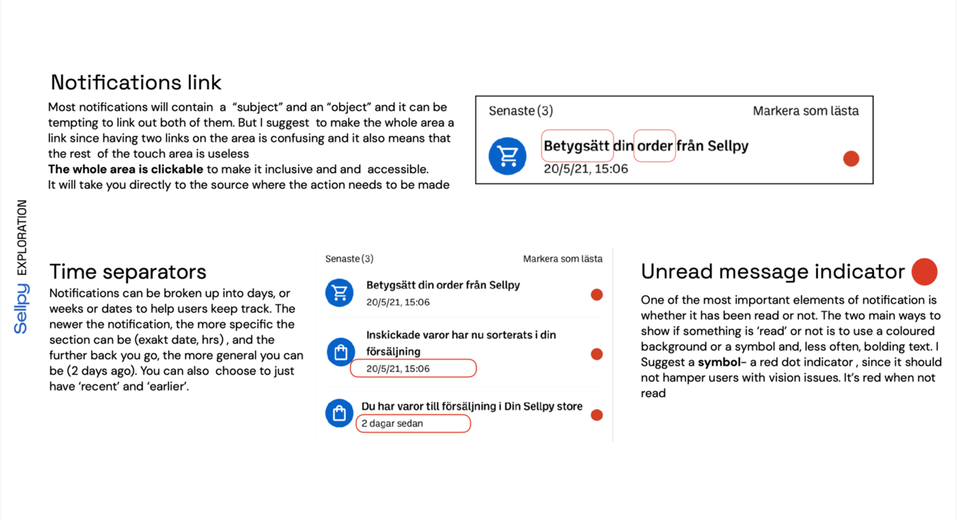
Explorations

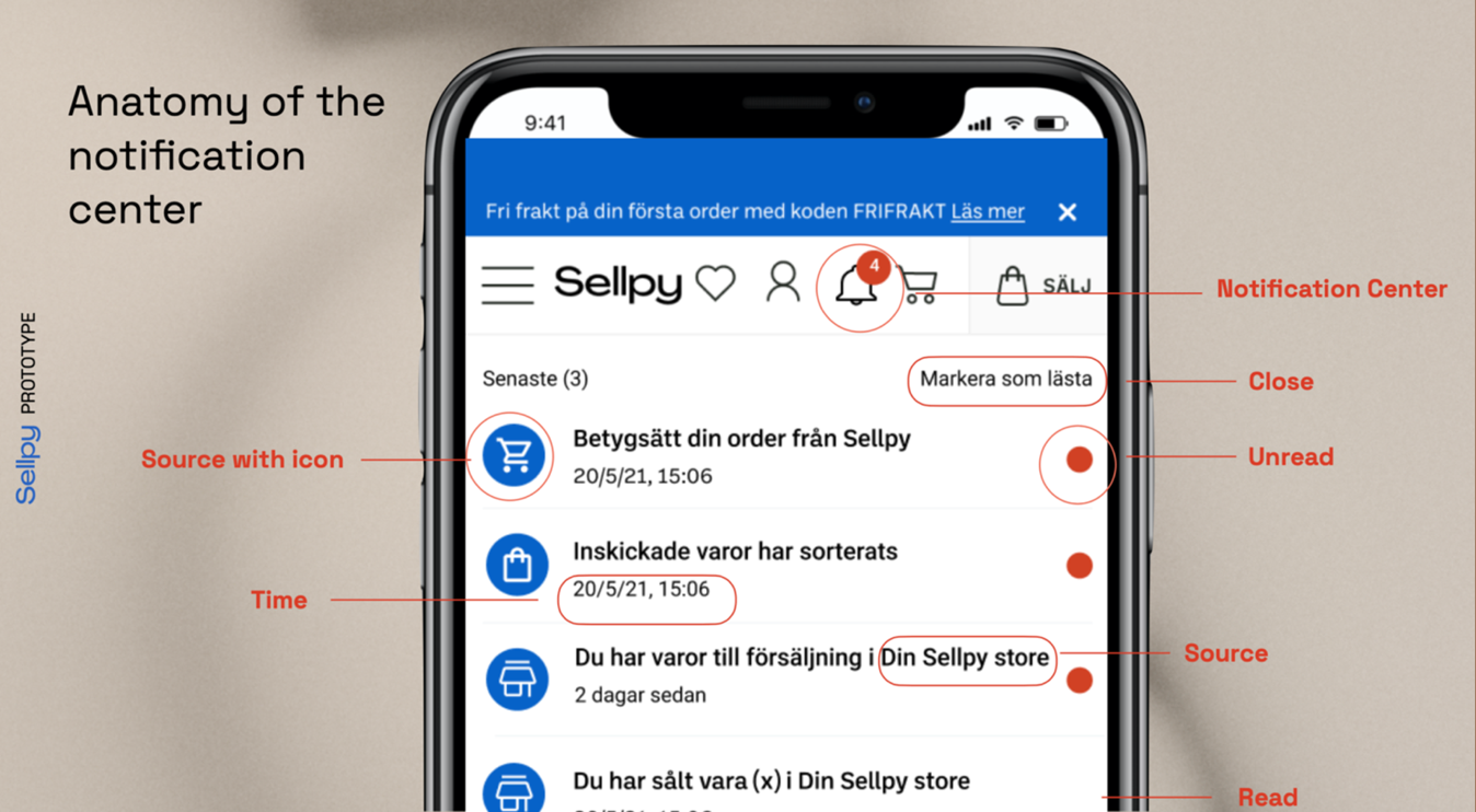
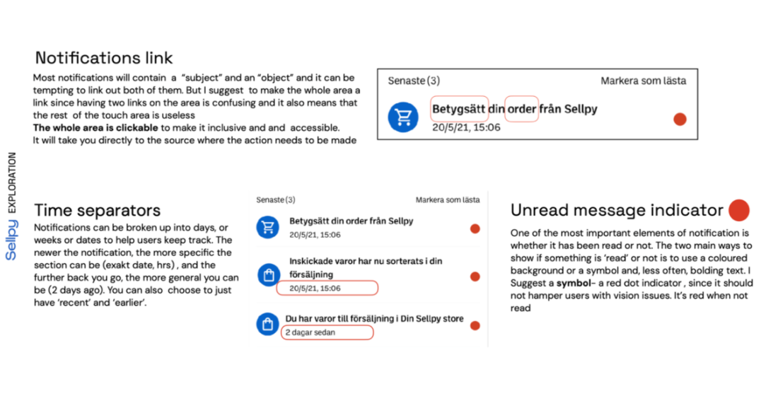
Prototype
When designing notification solutions I applied my findings and insights from my experiments and research. I exploited variations of the component design with iconography placement and size and after evaluated the designs I decided to continue with the ones that I could connect and validate through my earlier findings.
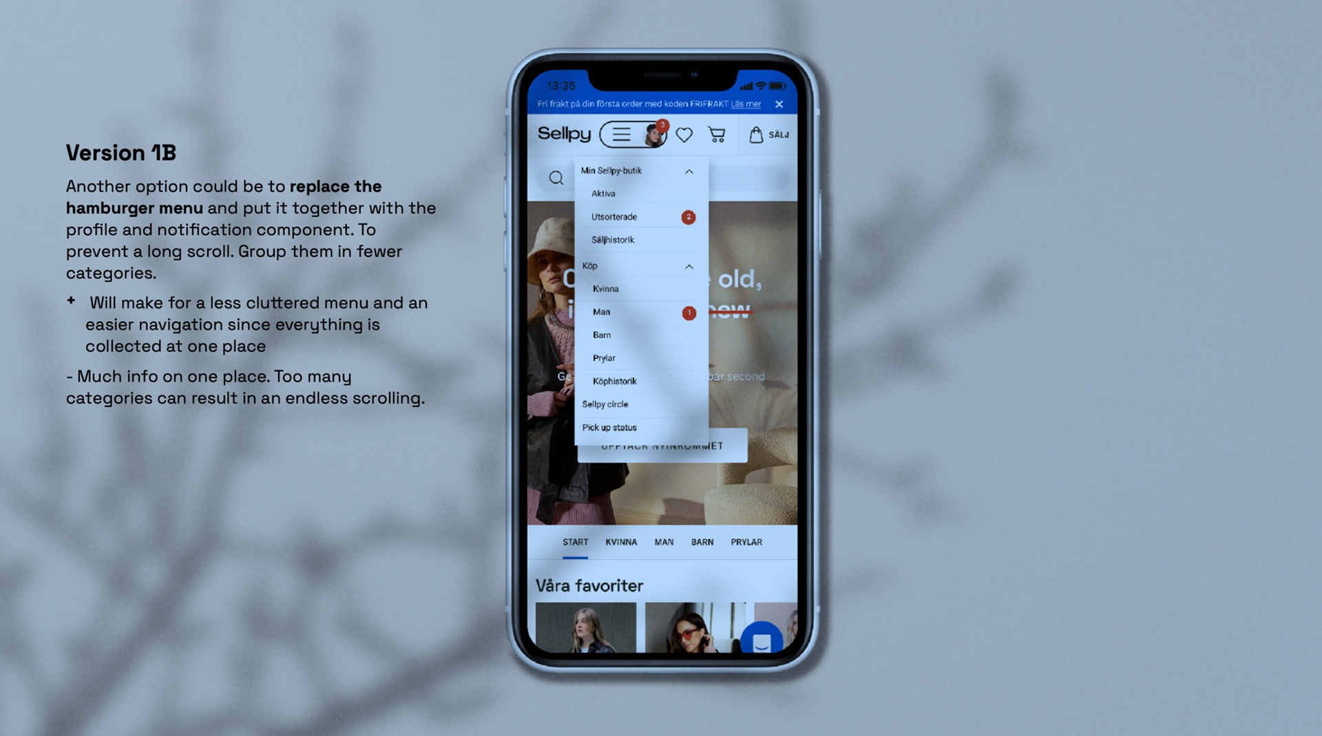
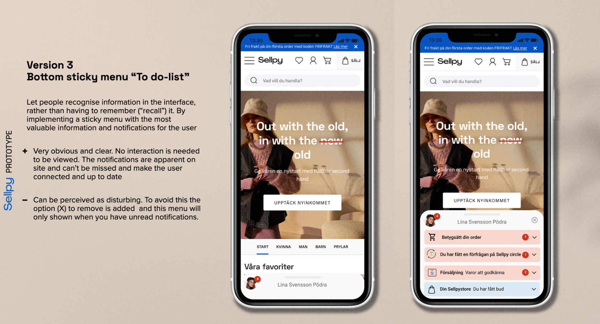
Prototype with notification center in hamburger menu
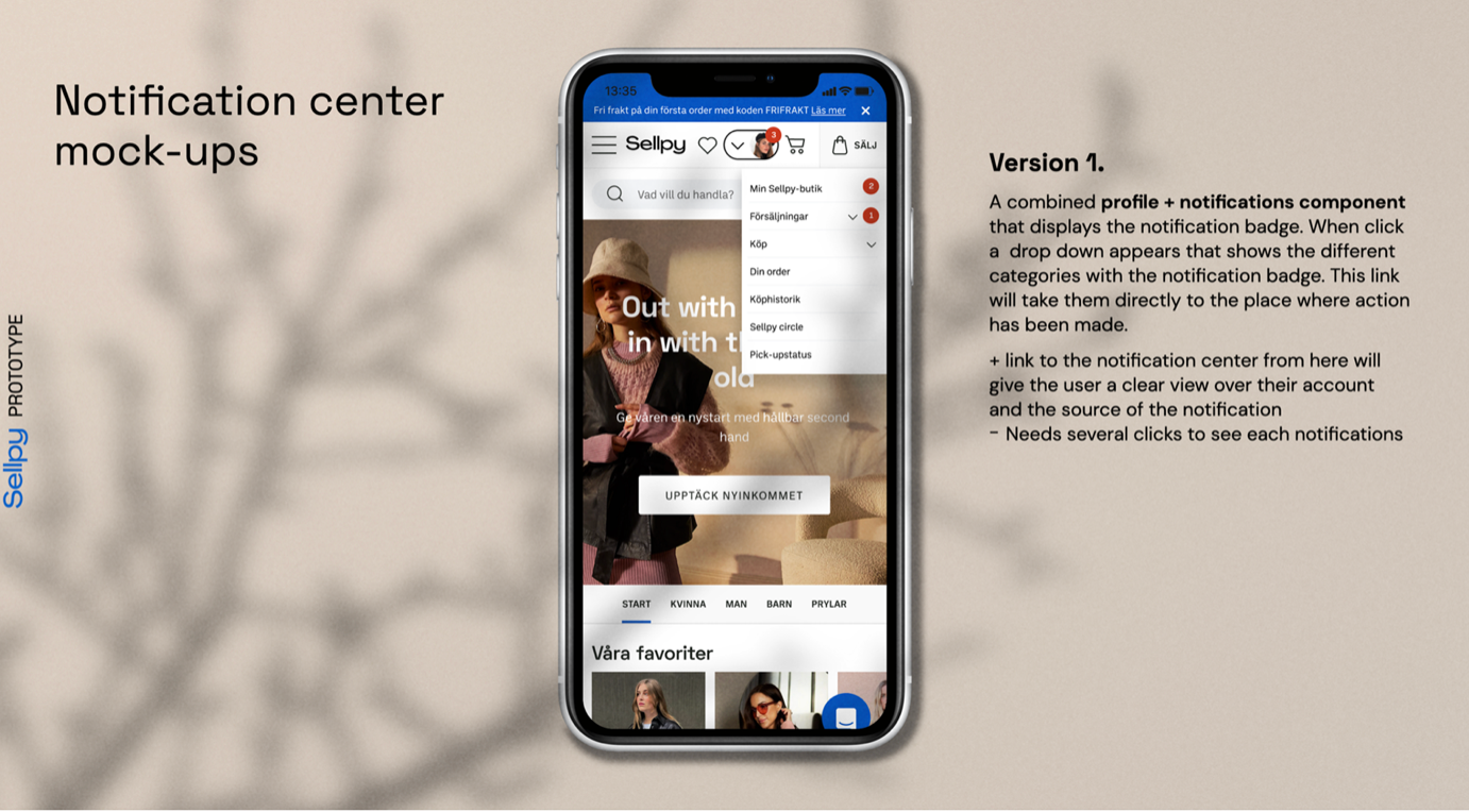
Prototype with combined profile and notification component
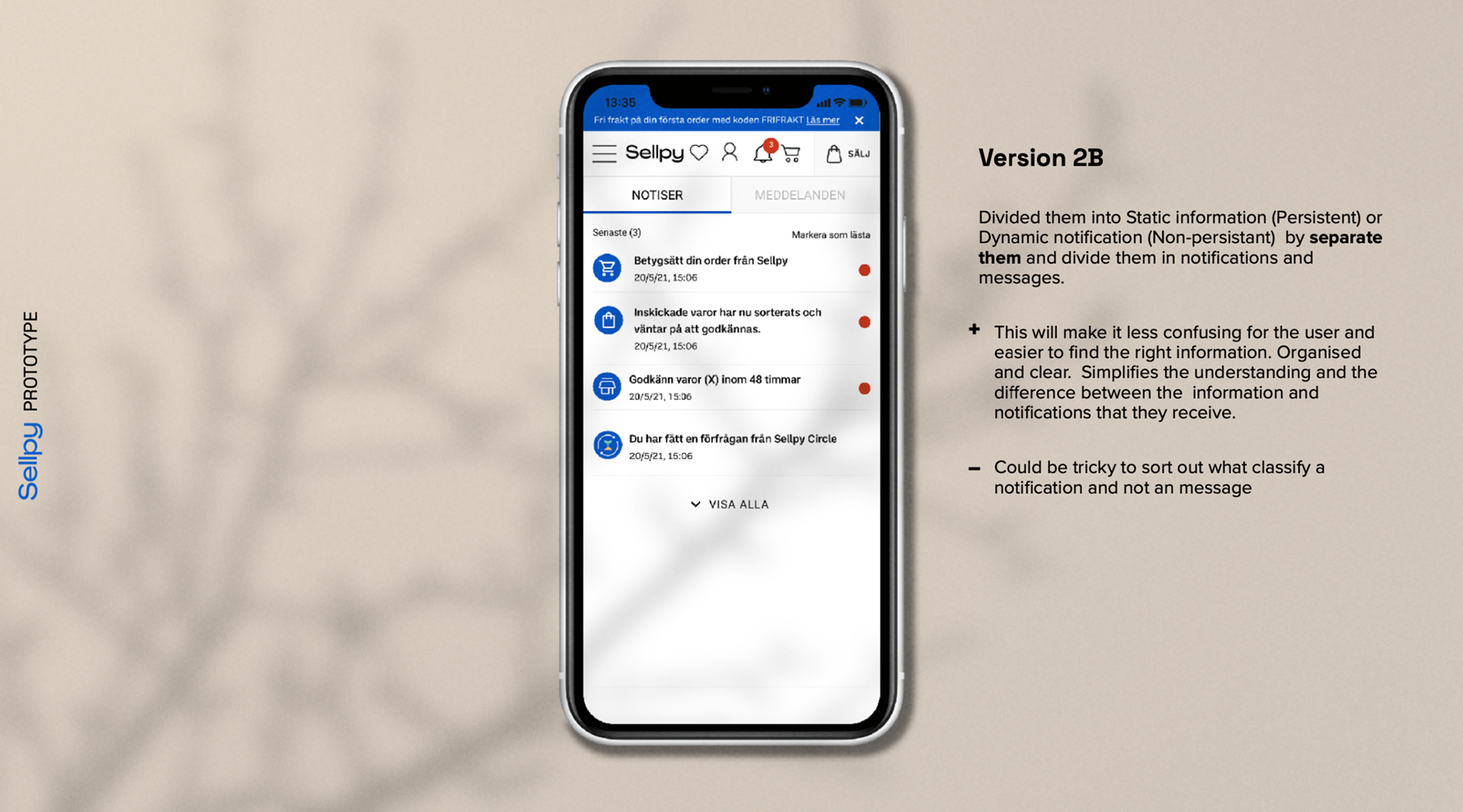
Prototype with separated options for messages and notifications
Final Design
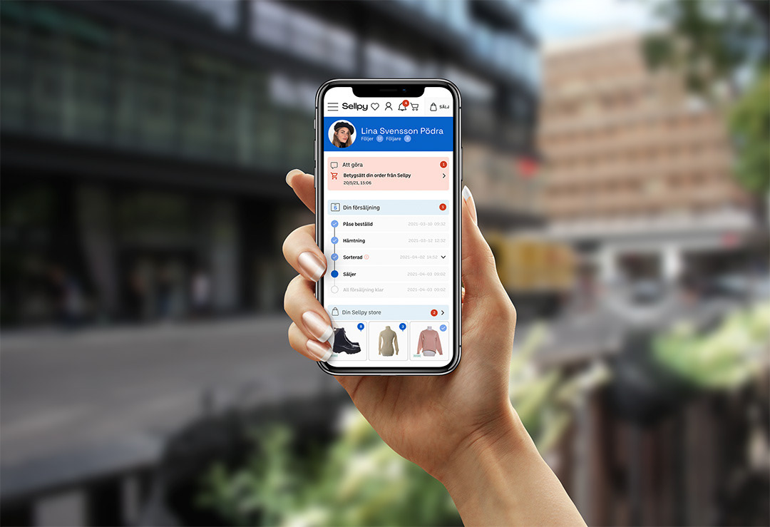
Notification Center and my account page
I crafted this design enhancement to integrate the Notification Center seamlessly into the user experience, specifically by refining the "My Account" page to be directly connected to it.
The updated "My Account", designed by me, focuses on enhancing user engagement and keeping users informed about account activities:
Upon tapping the profile icon, users are directed to the dashboard, which has been refined for a more personalized experience. A timeline feature is implemented to illustrate the status of actions and events relevant to the user.
Notification badges are prominently displayed at their respective sources, ensuring users are promptly informed about any updates or alerts.
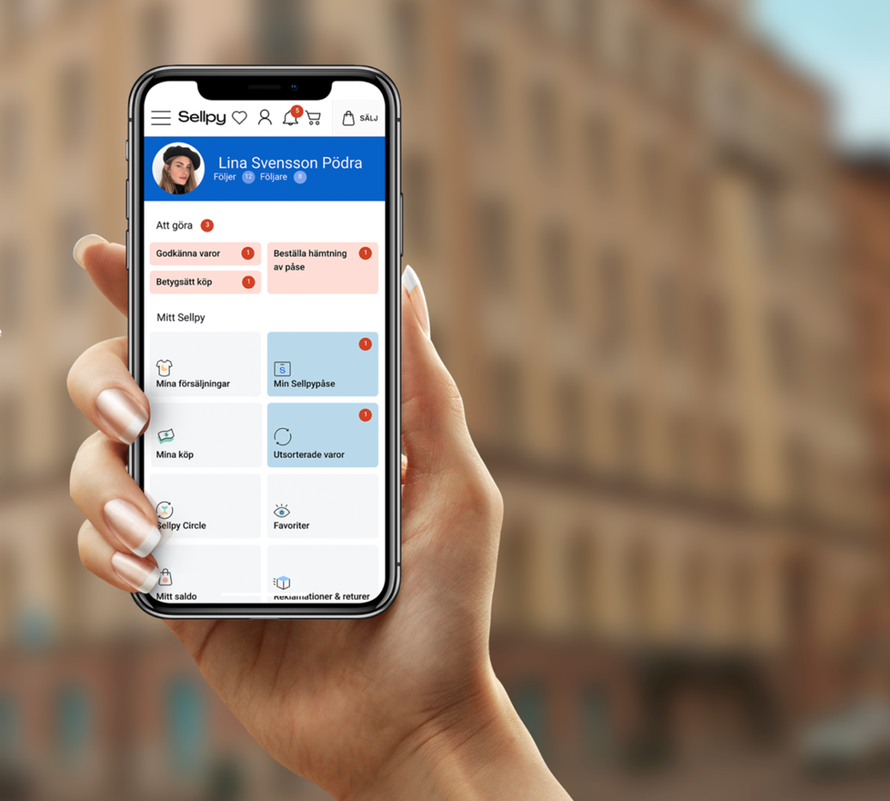
Final version notification and my account page
Profile page
When users tap on their profile icon, the account page is intuitively displayed, ensuring seamless navigation.
At the top of the page, the to-do list is prominently featured, prioritizing tasks for easy access. Categories are grouped and labeled to ensure relevance and clarity, streamlining the user experience.
Additionally, notification badges are displayed prominently and grouped according to their respective sources, allowing users to quickly identify and address updates.
Final design my profile page