UX Research/Analysis and Strategy
BRIEF
Enhancing User Experience
Through Data-Informed Planning
Philips Male Grooming users have a lower NPS (Net Promoter Score) compared to the average users on the Philips e-commerce site. Our client seeks to understand why this discrepancy exists and how we can enhance the satisfaction of male grooming users to achieve a higher NPS score and deliver an improved user experience.

What's eating Philips?
Where and Who?
Male Grooming Desktop users trying to find and buy a spare product in USA are struggling the most. They are more likely to be detractors and the NPS rate is only 8. By not being able to finish their goal and struggling trying to find their product the NPS is as low as-77
Why?
Philips users needs to be able to navigate with ease and brows on site without getting lost and not being able to complete their task. And they deserve a better user experience. This could hopefully make them end up being promotors for Philips webbpage and increase conversion rates. Satisfied and happy customers that are willing to recommend your store are more likely to return and make high-value purchases.
Assumptions
Male grooming users has too many choices to make wich leaves then overwhelmed and less confident in their navigation funnel.
Male grooming users who is using desktop is less satisfied and happy with their experience on Philips Page than on mobile.
Male grooming users can’t find what they are looking for and are not able to finish their goal.

Data analytics
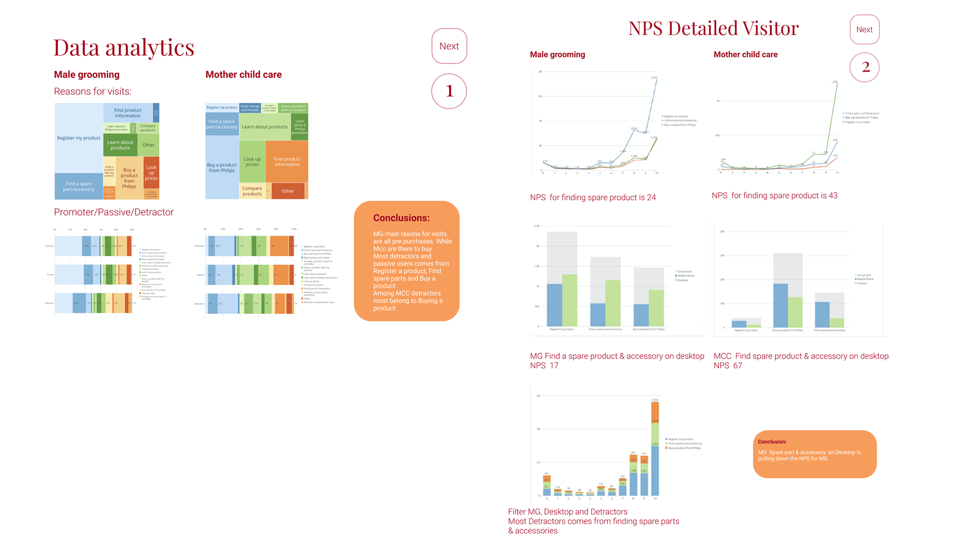
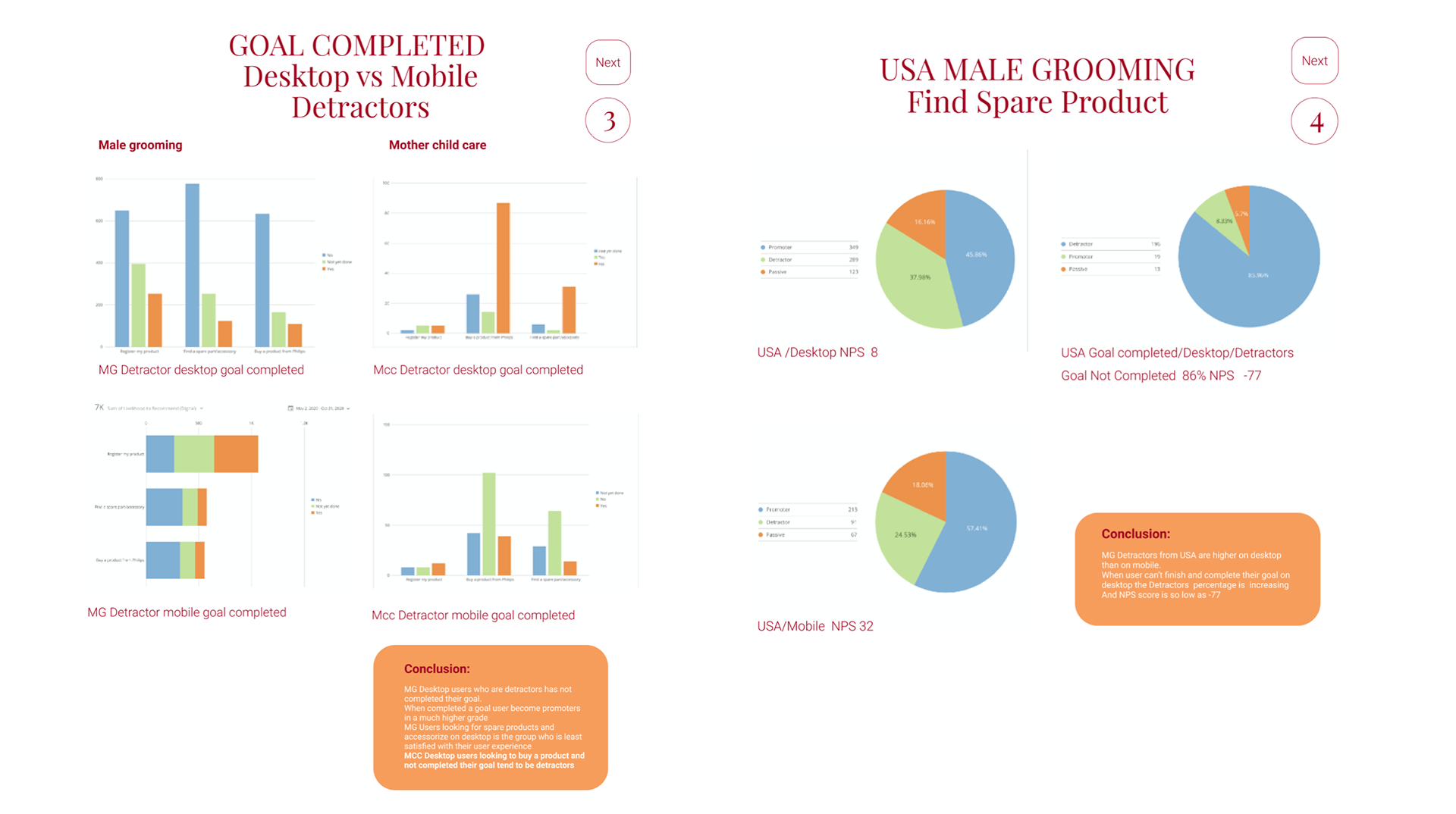
Insights
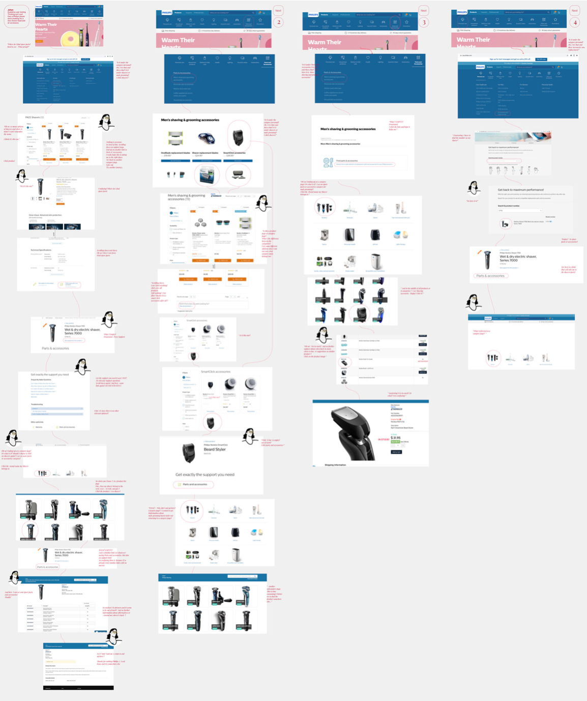
Users are caught in an endless loop, returning to the category page without finding what they need.
Confusing navigation, a lack of clear communication about product availability, and ineffective search functionality frustrate users, hindering their ability to complete tasks and leading to a poor experience.
Streamlining navigation, improving search features, and enhancing communication about stock status can significantly improve user satisfaction and engagement.
Key frictions
Irrelevant redirect links and unclear labels
Users are led back to their starting point with redirect links that lack accurate descriptions, making it unclear whether they are clickable or not.
Confusing categorization and filtering
Users struggle to find desired products due to confusing category labels and groupings, with unclear differences between them.
Lack of clear communication for out-of-stock products
Users encounter unclear information about product availability, often leading to confusion when items are marked as in stock but are actually out of stock.
Poor usability of the search bar
The search function fails to retrieve relevant results, leaving users unsure of their next steps.
Lack of intuitive navigation
Users face difficulty in navigating through the site due to excessive options and inconsistent page designs, leading to confusion about the next steps in the process.
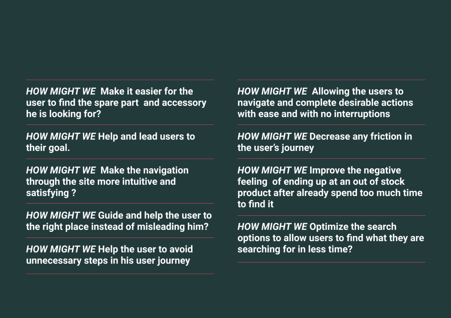
Ideation